Portrait by Jacqui Oakley
My journey to becoming a custom letterer began many moons ago in Bournemouth, England in the early 1980s. My Dad was away doing contract work as a design engineer in the aerospace industry, so on Saturday nights my Mum and my sister and I would sit and watch a show called Murder, Mystery and Suspense on ITV while eating Choc Dips and Sherbet Fountains.
After one particularly grisly story about a vigilante scarecrow ghost, we decided to decompress before bed with an episode of Entertainment USA - a weekly, half-hour rundown of everything amazing happening in the magical land of America. On that night’s episode, the host interviewed a musician named Malcolm McLaren about his new song, Buffalo Gals.

Malcolm McLaren was English - primarily famous for discovering and managing The Sex Pistols. But he had visited New York and discovered a new style of music called Hip Hop, and instantly fallen in love with the culture. After befriending a group of DJs collectively known as the World’s Famous Supreme Team, McLaren started producing Hip Hop of his own.
Buffalo Gals was unlike any music I’d ever heard before - hard and attitudinal, but with a completely original and killer groove. But best of all, I discovered that Hip Hop came with its own art form: graffiti. I was mesmerized from the get. Explosions of color and form and letters - actual letters from my own beloved alphabet - warped and twisted into bubble-exploded knots and swashes that were barely even recognizable as words any more. And yet those words were there, and they were beautiful - a whole new creation, unprecedented in their audacity.
My imagination was ignited, and I started scratching out graffiti letters of my own - scruffy, formless blobs at first, but as the years passed my synapses started to make connections that would express themselves visually in the smooth and playful connectivity of true graffiti art (if only on paper). There isn’t a ligature or a swash I’ve created since that doesn’t have its roots in the Hip Hop culture of the 80s that dominated my teenage thinking.
I dabbled casually with different forms of lettering over the coming years (calligraphy was a dalliance I occasionally enjoyed but never truly got the hang of), but it was only in my second year of college pursuing an unknown and unfocused future in the sciences that an assignment in my drawing class catapulted me in the direction of the graphic arts. My drawing teacher (whose name I’ve tragically forgotten, but God bless the man forever) told me that the projects I’d been turning in fell squarely within the realm of graphic design (whatever that was) and that I might consider exploring what that could mean for my professional future. “You mean I could get paid for this?” I asked. “Not much,” my teacher replied presciently.
Warnings aside, I went for it. I graduated from the University of North Texas in Denton in 1999 (omg) with a degree in communication arts, and hopped over to Dallas to become a junior graphic designer at Tractorbeam.
I spent my formative years as a designer trying to create the perfect logo - drawing cats and plumbers and planes, and salivating over all the happening new fonts that were coming out like Mrs Eaves and Bello. I adored the world of fonts but could never imagine creating a typeface - or any type of custom lettering - myself. I remember telling a friend that people who designed fonts for a living were suckers. Why spend months creating a font - a whole, actual font - when you could be having all the real fun using them?
By the late 2000s, however, clients began leaning toward creative solutions for their branding that utilized expressive new forms of custom lettering and bespoke, one-off type designs instead of the usual tired though time-tested font-driven remedies (shout out to Tom Law! Wouldn’t be here if it wasn’t for you my friend). Despite having loved and thought about lettering in one form or another since childhood, I’d become so used to the standard method of design (choose a font, draw a symbol, select some colors, Bob’s your uncle) that I stepped only tentatively into this new and untested world. Nevertheless, what had begun as only a timorous endeavor soon became a time of furious experimentation with lettering that felt deliberately and overtly “custom”. Words like “handcrafted” and “vintage” began to come into heavy use among clients and designers alike.

Then in 2011 I met Ed Gibson. Ed was a Bristolian with an already long and proven career in cider, now living in Austin and determined to fill a clear and obvious gap he was seeing in the local beverage market with a new cider of his own. The idea was to tap into America’s long and largely forgotten relationship with cider and leverage the current visual trends toward nostalgia that were so vital to the cultural vibe in Austin at the time - especially on the east side of town, where he planned to set up shop.
Ed pushed me to work with vintage scripts - something I was anxious about tackling in any real way (so unforgiving, so many rules, so many opportunities for mistakes). But through persistence and some mutually agreed upon patience between the two of us (and no small amount of trust on Ed’s part), some real ideas began to break through that made me think that maybe I could make this work.
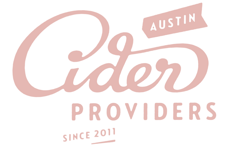
But a lot was still up in the air. Ed had finally settled on the name Gold Top for his flagship cider, but the name of the company itself remained undecided. More rounds of frenetic back and forth between the two of us ensued, until at last a sketch broke through that both of us seemed truly excited about. The name Austin Eastciders was settled on (I mean, of course it was), and within a few months, Gold Top bubbled into life at last.

I look at this design today and I see everything wrong with it that I would change if I had another chance. But making it perfect was never really the point - we got lucky that way. Regardless, Eastciders set me on a new path that I feel I’m still on in so many ways… but a path to what? I used to think it was perfection, but I can’t be bothered with that any more. Still, if I ever figure it out, I’ll come back and let you know.