I fell into font-making despite believing it was something I was not only not interested in, but also completely incapable of. But as I’m sure happens with so many lettering artists who’ve spent years trying to refine their craft, the fonts eventually started making themselves. Suddenly, it felt as if I couldn’t make them fast enough.
Pizza Hut
GSD&M came to me back in 2020 with an amazing proposition: create a font based on the original Pizza Hut logo - as if the logo had been created from a font that had once been beloved by many, but that had been tragically lost to time… until now.
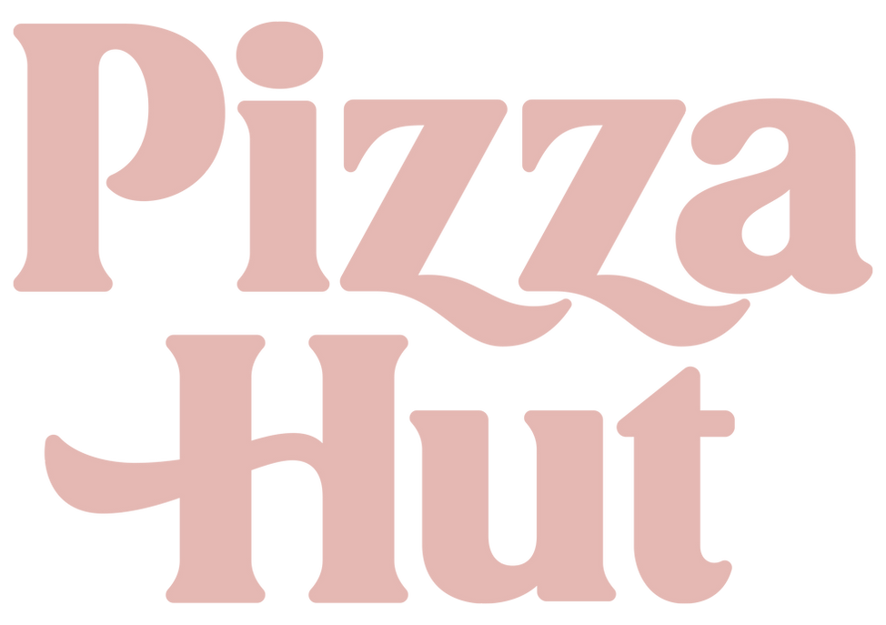
The approach was relatively straightforward: redraw the old logo from scratch, and in the process of refining those letters begin to develop some “rules” that could be applied to the missing letterforms.

It was a breezy, joyful process - I’m not sure if I’ve ever enjoyed a project so much. A million thanks to creative director Dale Austin, design director Marc Ferrino, and project manager Marilyn Rose.

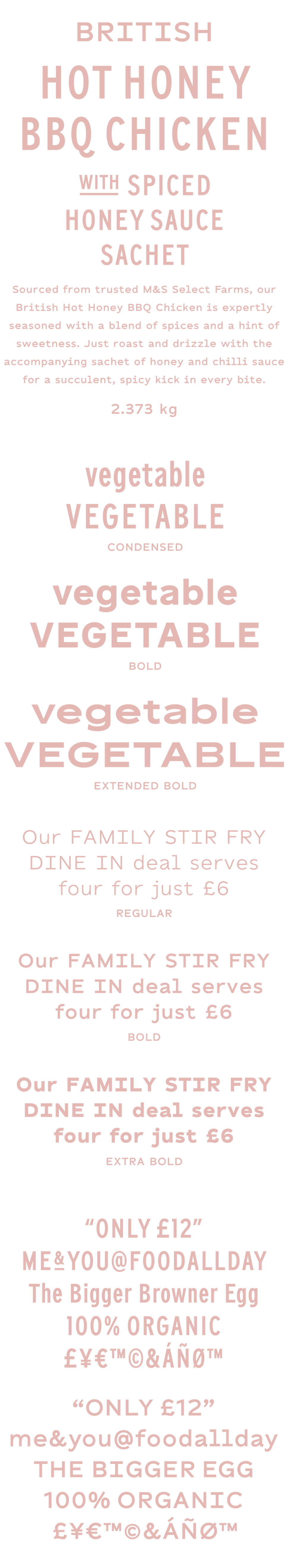
Marks & Spencer
I spent many hours as a kid following my Mum around Marks & Sparks buying clothes for school. I’m sure we bought more than that, but I remember the back-to-school clothes more than anything. And undies. Loads and loads of undies. So I was thrilled when Whippet reached out to us for some font work for M&S Food earlier this year. We created two distinct font families for them: Display and Text, each in multiple weights and widths. Creative direction and overall amazing support and love via Ashley Hodge, Sean Dwyer, Amber Sims, Ben Hutchings and Sarah Butler.
Garrison Brothers Whiskey
Back in 2018, The Shop came to us looking for a custom font for their client, Garrison Brothers, that would evince the brand’s dedication to its Texan roots while simultaneously evoking the luxury of their products. We were only too happy to oblige.


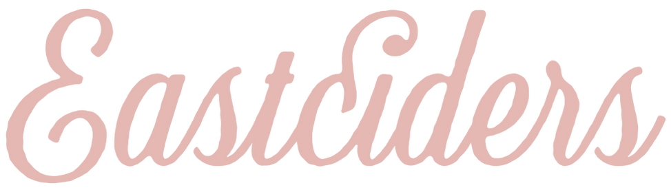
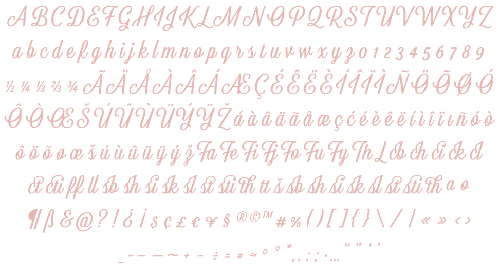
Austin Eastciders
In 2016, Austin Eastciders’ owner Ed Gibson and I were in the middle of a work session at my place, preparing art for the upcoming variety pack and fiddling around with the lettering on the side of the box, when I said, almost under my breath, “we should just make this a font and be done with it.” Ed paused and raised an eyebrow speculatively. “I mean yeah,” he said with a grin, “why not?” It was easier said than done, but I began work on it as soon as I could, and before too long we’d made a working script that continues to be a workhorse for the creators at Eastciders Central to this day.